Tracking the Coronavirus Pandemic at Weather.us
Hello everyone!
As we’re all well aware by now, a new coronavirus outbreak (COVID-19) is rapidly spreading across the world leading to significant disruptions to daily life especially in the countries most affected. Our specialty here at weather.us is of course the weather, so this blog won’t be covering the outbreak day-by-day like we would a hurricane or blizzard. That said, we do know a few things about visualizing data to make sense of a rapidly changing situation. With that in mind, we’ve added some tools to weather.us to help you follow along with new cases of COVID-19. This post will show you how to find and use these tools to keep track of new and existing COVID cases over the coming days, weeks, and months.
For those who prefer a video version of this information, it can be found at the bottom of this post.
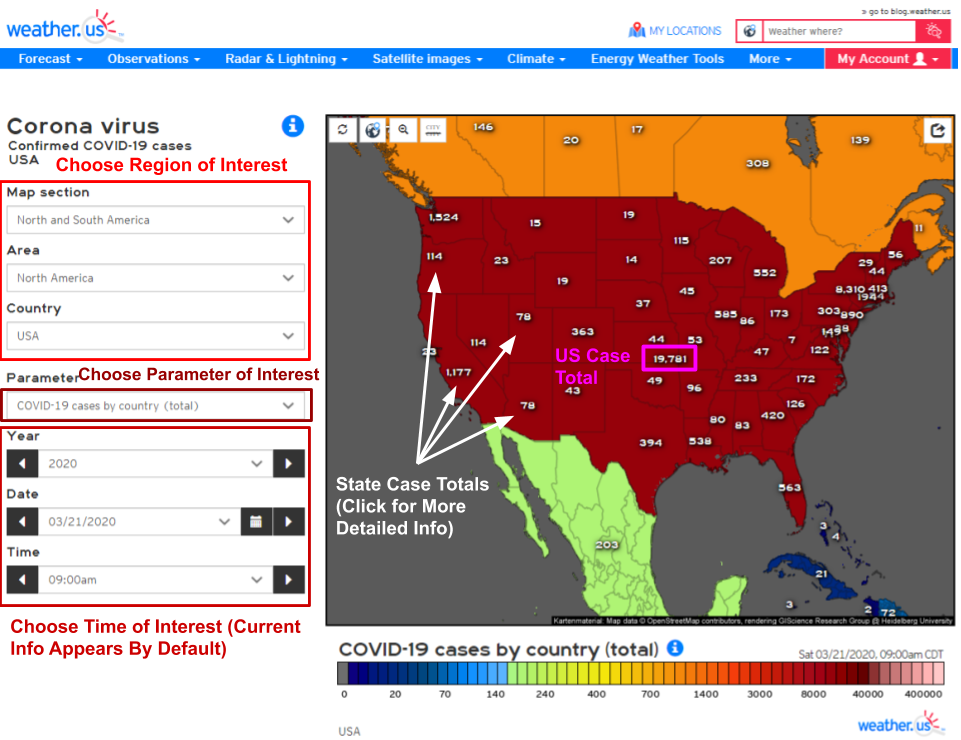
To find our COVID-19 tracking maps, head on over to weather.us then mouse over the “more” tab near the left of the upper toolbar. Once that menu drops down, you’ll notice a couple links on the right side of the dropdown under the “Corona Virus” heading. Clicking on either link (for cases or deaths) will bring you to the page with maps.
This interface will look familiar to those who use weather.us regularly for analyzing meteorological data. The menus to the left of the image let you select your region/parameter/time of interest while the information displays on the main map. The shadings on the map represent cases per country (notice the US has many cases so it’s colored dark red while Cuba has few cases and thus is colored dark blue) while the numbers represent either cases per country or cases per state. Clicking on any of these numbers will open up a smaller window with a graph that has several new options for viewing data.
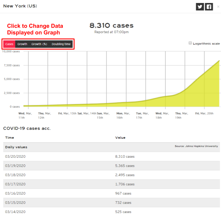
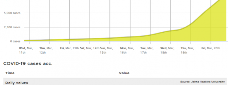
This is an example of the state/country-level graphs and tables you’ll see by clicking on the white case numbers on the maps. We have several different datasets available, and each can be accessed using the buttons at the top left of the graph. Because unchecked epidemics grow exponentially, it’s often easier to analyze the data on a graph with a logarithmic scale. You can change the scaling of any graph by clicking (or un-clicking) the “logarithmic scale” box at the top right of the graph.
Finally, remember that these figures are only as timely and accurate as the sources we draw the data from (Worldometer and Johns Hopkins University). They don’t represent the *actual* number of infections in a given area because some countries (especially the US) don’t have the resources to test everyone who may have the virus. You should not assume that your risk of infection is low or zero in an area where few or no cases have been confirmed. Finally, please heed the advice of health officials regarding quarantine/self-isolation/social distancing/etc. Who knows how long this whole thing will last or how bad it will be, but if we all stay home and away from others for a while, it will surely be shorter and less brutal than if we continue ‘business as usual’ for the next few weeks.
-Jack

