What Are Skew-T’s and How Do You Use Them?
Hello everyone!
We recently added upper air observations including Skew-T/Log-P diagrams to weather.us so you can better understand the vertical structure of the atmosphere as measured by instruments attached to weather balloons. These instruments are known as radiosondes and generally collect temperature, pressure, and dew point readings as they ascent through the atmosphere. By tracking their location as they ascend, the wind speed and direction at various altitudes can be derived. While at first glance it might not seem like much information (just three directly observed and two derived parameters!), plotting the temperature, dew point, and wind speed at various pressure levels (pressure is used as a vertical coordinate in meteorology since pressure decreases at a known rate with height and it’s easier to measure pressure than height) can tell us a ton about what the weather might do over a given region at a given time.
Because there’s so much you can learn from soundings, this post will not be a comprehensive guide to all possible applications of skew-T/log-P diagrams. My goal here is to ‘show you the ropes’ of what these diagrams are, how to read them, and one of their most common/useful applications (to severe thunderstorm forecasting).
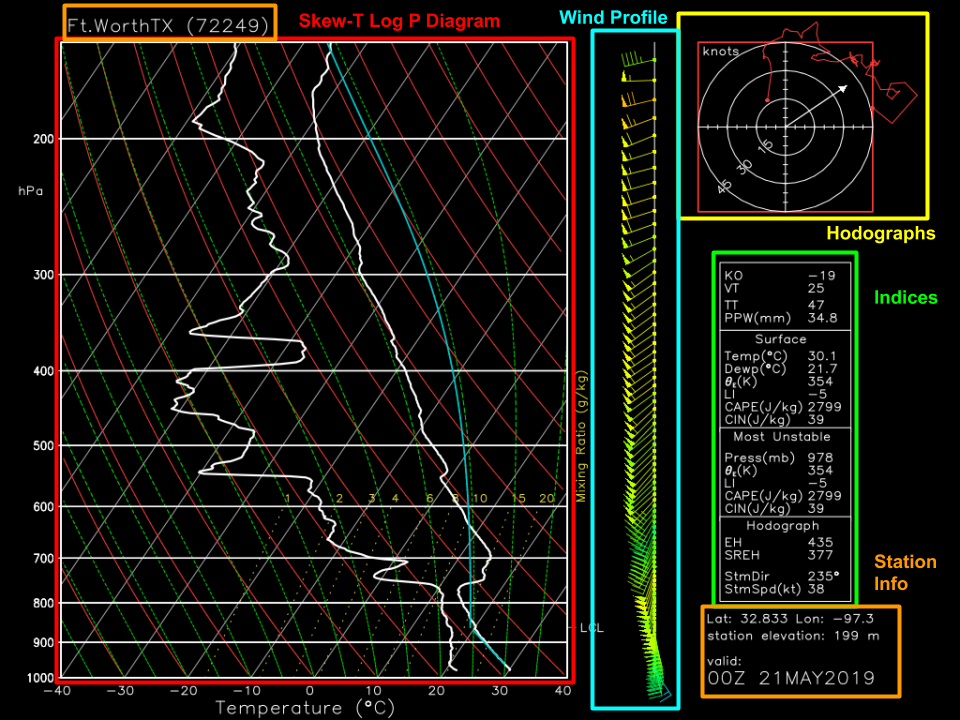
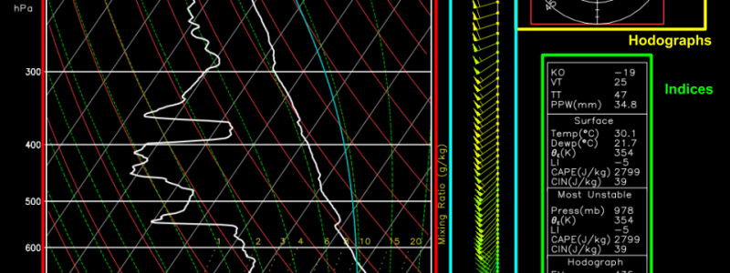
Here’s what you’ll see if you go to the upper air observations page at weather.us and click one of the station observations. The image you’ll see has several different parts, each designed to provide you with different information. The main skew-T/log-P diagram is boxed in red, and is designed to show you how the temperature and dew point changes with height. To the right of the skew-T/log-P is a series of wind barbs that show you the wind speed and direction at each height for which observations are available. To the right of the wind profile is a series of values computed from the sounding that are meant to give you a rough estimate of how stable/unstable the atmosphere is and how much wind shear is present at different levels. These indices only represent a small fraction of the information available in a sounding, and the only way to get the full picture is to look at the full sounding! The last important part of the graphic is located at the top right and is known as a hodograph. A hodograph is constructed by connecting the ends of the wind vector plotted at each height, after setting the start point of the vector to a common location. The stronger the winds are, the longer the vectors will be, and thus the farther from the origin the hodograph line will be.
An in-depth discussion of the hodograph and its usefulness will come in a later post, but for now let’s focus on the skew-T/log-P diagram.
Here’s what each of the lines you see on the graphic actually means. Take a second to read through the text on the right side of the image so you know what each line is referring to. If you look at the isotherms (lines of equal temperature) and the isobars (lines of equal pressure), you’ll see where the chart’s name comes from. Because the temperature decreases so rapidly with height, the isobars have all been skewed 45 degrees to make the graph more readable, hence the name skew-T. Because the pressure decreases exponentially with height, the isobars are plotted on a log-scale, hence the name log-P.
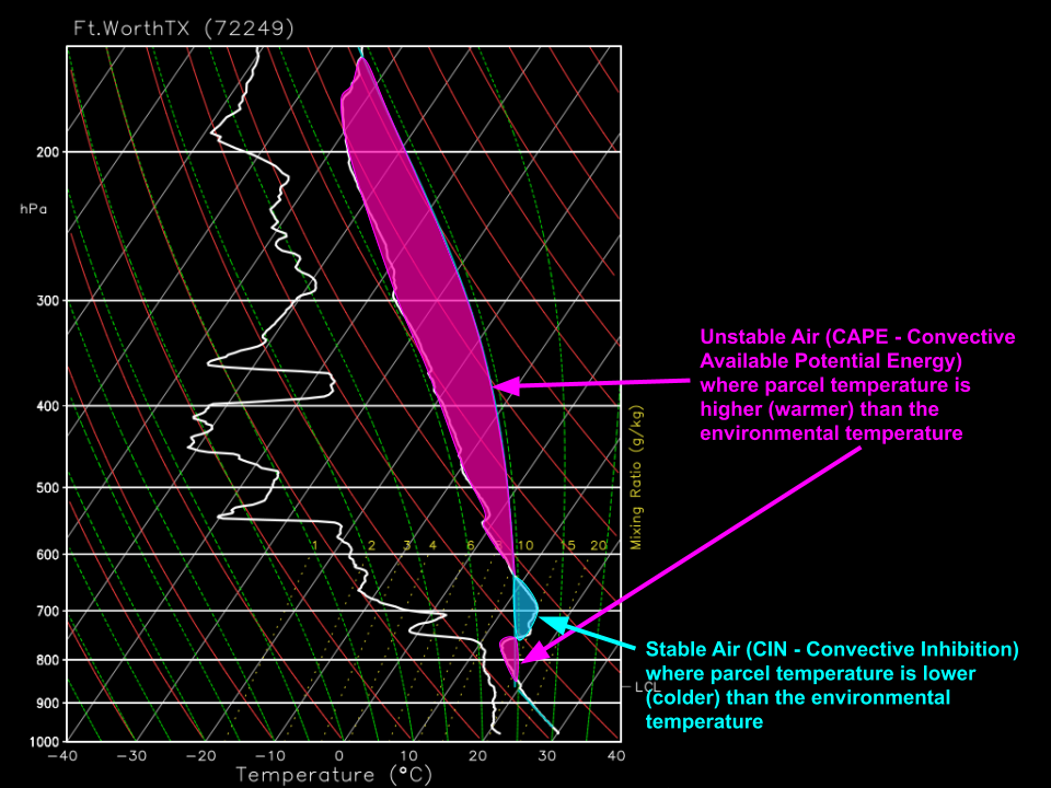
Here’s one of the most common applications of the Skew-T chart: evaluating instability during a potential severe thunderstorm event. If you’ve read this blog for a while, or are familiar with severe thunderstorm forecasting, you’ve surely heard of the term CAPE, which stands for Convective Available Potential Energy. If you’ve ever wondered how that value is actually computed, the answer can be found on the skew-T/log-P diagram! When an air parcel (a hypothetical basketball-sized chunk of air tracked for the purposes of meteorological analysis) is forced (by a front/dryline/mountain/etc.) to rise from the surface, would it be warmer or colder than the environment? The answer to this question will determine whether the parcel accelerates towards the top of the atmosphere (unstable) or sinks back towards its original location (stable). The magnitude of this acceleration (i.e. how fast the air will rise or sink) is proportional to the difference between the parcel temperature at any given height and the environmental temperature. By integrating the area between these two lines, we can determine the amount of CAPE (potential upward acceleration) and CIN (potential downward energy) present over a given location at a given time.
While we’ve barely scratched the surface of what skew-T/log-P diagrams and hodographs are capable of, hopefully this post has given you a basic idea of what you’re looking at when you pull up a skew-T/log-P plot on weather.us, and why they might be useful in a practical forecast setting.
Our upper air archive goes back to May 2016, so make sure to use the calendar icon to explore upper air data for your favorite weather event in the past few years!
-Jack
