Inside a Forecaster’s Mind: The Top-Down-Approach
I decided I wanted to share what it’s like inside a meteorologist’s mind – at least a look inside my mind and how I construct a highly chaotic, nonlinear “system” such as the atmosphere.
In school we were taught the conventional “Top-Down” approach to forecasting. This is a way to visualize the atmosphere in 3-D and work your way down from the top to the bottom of the atmosphere where the planetary boundary layer (PBL) lies.
Disclaimer: There’s no wrong sequence in approaching forecasting because the upper and lower levels of the atmosphere are interdependent consituents of the atmosphere entirely. A change in one level influences a change in another. However while dynamically connected, meteorologists start with the upper levels because this level isn’t affected by friction, evaporation, thermal heating, and other phenomena. This just makes it more simple to digest and evaluate which leads you to make your way down to where you begin to see those finer details and can dig into other meteorological processes.
For example, breaking down the conventional approach level by level is what meteorologists such as myself look for on a daily basis. I won’t get too technical into how some meteorological processes work but will try to do my best to explain and keep it as simplistic as possible!
We start at the top:
- 250mb-300mb
Cold months vs & Warm months: We use the 300mb level during the winter months, which is closest to the bottom of the atmosphere because since cold air is denser than warm air, layers of the atmosphere are simply more “flattened” as opposed to the warmer, less dense air. Hence, pressure levels will be more compacted, and therefore lower. We use 250mb during the summer because as mentioned, warm air means it’s much more readily buoyant due to its density, and rises so we must venture further toward the top of the atmosphere.
These levels are used for:
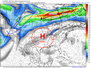
- Jet stream and jet streak locations. Pictured here I outlined the general jet stream (white), which is just an area of fast moving winds. Picture a river. You place a boat in the middle. It’ll just follow the flow of the water. This is exactly what the jet stream does globally, carrying energy in the form of systems that cycle around the globe.
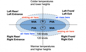
- Jet streak quadrating: For some, this will scratch your head, but I’ll make it super simplistic: We try to break the jet streak into 4 main sections. If you start at that red dot I plotted, imagine that’s you and you’re looking downstream. To the right is dubbed the right entrance region (RR), left is the left entrance region (LR). On the opposite side are the left exit region (LE) and the right exit region (RE). Due to differences in temperature and pressure, parcels of air undergo shifts in the vertical as a result of divergence and convergence; a basic law known as mass conservation. In the RR region, air converges and since it can’t go down into the ground, it must evacuate vertically upward. This evacuation of air causes air at the surface to converge, leading to rising motion. Rising motion is indicative of pressure falls, which eventually leads to lower pressure and inclement weather. That same air now must sink in the left entrance region, which is upper-level convergence and then sinking air. Take the same process, but flip it in the exit regions. The left exit region divergence (rising motion) and the right exit region sees sinking motion as a result of mass compensation. This law simply states that if energy is being taken out of one place, it must be balanced and that “void” must be filled. So rising air (divergence) leads to air rushing in at the surface. Convergence implies sinking motion, or high pressure. We look for these jet streaks because it’s these features that can dramatically influence the lower levels, leading to a enhanced rising motion, and exacerbating weather conditions that may be occurring from a cyclone at the surface.
- Ridges and troughs: You can identify these features since it’s at the top of the atmosphere, untouched by friction and garnered through streamlines that outline these features as I did myself.
Taking that same concept and to help visualize it, I’m attaching an image to help conceptualize this process. Labeled are the subjective entrance and exit regions.
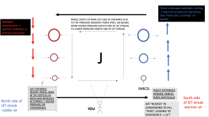
To better illustrate this concept (trust me, it took quite a while to fully grasp this, so I wanted to explain this in further detail). Hopefully the graphic and annotations can get the point across, but this is YOU looking INTO the jet streak itself. The whole reason why the air rises and then shifts to the opposite side is because of the pressure gradient force, where air is directed from higher pressure to lower pressure. So imagine a parcel (hypothetical “blob” of air) minding its own business as it slowly approaches this straight jet streak. All of a sudden, it “feels” this acceleration and shifts to the lower heights (north side of jet streak). Suddenly, it’s out of what we call geostrophic balance ( a balance between the PGF and Coriolis force, where acceleration is zero), and coined as ageostrophic (out of balance where acceleration is nonzero, so forces are acting on the parcel). It’s this response that causes air at the surface to converge and rise vertically, leading to lift and this equates to divergence. On the flip side, the air converges at the top (top left in diagram) and sinks, warming adiabatically and this is where we have convergence, or sinking air (high pressure). That is it in a nutshell. You simply reverse the order at the exit region of the jet stream, where now the left exit region experiences rising motion and the right exit region experiences sinking motion. Hopefully this long and winded explanation helped you to visualize this process!
500mb
- Used to identify the general steering flow for weather systems
- Identify ridges and troughs
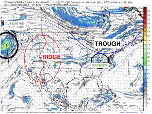
- Area of vorticity: PVA and NVA – positive vorticity advection and negative vorticity advection. Vorticity is the local measure of spin around a certain axis. Think of it like a ball of energy in the atmosphere that stretches like a slinky and can be rotated both in the vertical and horizontal. How it moves and stretches dictates whether we see rising motion or lack thereof. We coin is “PVA” (positive vorticity advection) when areas of higher vorticity advect into areas of lower vorticity – this is associated with uplift (needed for lowering pressure and therefore clouds and precipitation most likely). “NVA” (negative vorticity advection) is the complete opposite. Areas of lower vorticity advect into areas where there WAS higher vorticity. This doesn’t produce uplift, rather, it supports more benign conditions. I do want to emphasize that this shouldn’t be looked at ONE level; rather, it should be looked collectively from the surface to 500mb to see if whether or not vorticity is increasing OR decreasing with height. Regardless, we use this concept because vorticity or “spin”, allows low pressure systems to form and mature depending upon other factors of course. I highlighted an area within the long wave trough of what’s a shortwave moving at the base. This cyclonic shift in wind, indicative of a shortwave trough, would be monitored to see how it progresses through the flow and out ahead of it is where you’d expect to see rising motion and a greater chance of precipitation.
700mb
- Used to identify depth of moisture advection, cold advection, and warm advection
- shortwaves propagating through the flow that may be missed by 500mb analysis
- inversions
- uplift and subsidence
- wind direction and speed – especially for airmass thunderstorms that can be used as a proxy for the steering flow
- vertical velocity
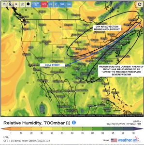
Above, this shows relative humidity. Now this shows just one level of course, and it’s critical to analyze essentially the surface up to about 500mb, but nonetheless we like to look at this level for where there may be dry layers that influence below. For instance, you can identify with what is most likely a cold front that’s propagating southeastward into the Ohio Valley and Eastern seaboard. Behind it, we have drier air denoted by the brighter orange coloration. We can induce that dry air is likely associated with cold air aloft, which implies sinking motion and fair weather. On the opposite side of the cold front is higher moisture content, denoted by the green. A cold front is a synoptic scale feature that forecasters look for to see how it’ll impact local areas because not only is it an indication of the leading edge of the trough (downstream of the trough is where we see divergence, or rising motion); it’s simply a lifting mechanism. Cold, dense air undercuts moist, warm air, which can lead to severe weather such as strong thunderstorms if the thermodynamics and kinematics (motion of air) of the atmosphere are sufficient!
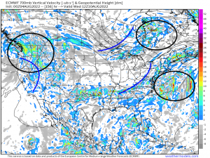
One other big thing we look for is what we call UVV’s, or upward vertical velocity. Simply put: positive(+) UVV means rising motion verbatim on this chart using the legend. negative(-) UVV’s implies sinking motion, associated with the gray colors. Greater the vertical velocity, the greater the air rises to a level that eventually leads to heavier precipitation, which is why we like to look at this product. I outlined 3 main areas ahead of shortwave troughs that show relatively greater vertical velocities, which isn’t surprising to find that they happen to be located just downstream the trough axis’s. Here is where you’d want to look for and corroborate if precipitation is occurring, or will occur during this timeframe.
850mb
- Used to identify shortwaves as well
- Acts as a surface map in higher elevations (i.e. Rockies)
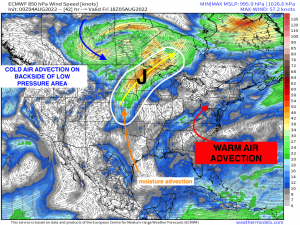
- Thermal Advection: cold air advection – where winds blow from a colder airmass/source to a warmer airmass. You see this behind mid latitude cyclones especially, like with what I annotated below. Warm air advection – winds blow from warm airmass/source to a colder region. You see this in warm sectors behind a warm front and ahead of a cold front. Warm air advection leads to rising motion, so meteorologists need to know where and how strong warm air advection may occur and how it could lead to potentially hazardous weather.
- Moisture advection
- frontal boundaries
- Low level jet!
Above, I’ve depicted a few key concepts and something forecasters would look for, especially the LLJ placement (low level jet). Ahead of the mid-latitude cyclone I depicted the placement of the LLJ – a localized area of fast moving winds. This feature is very important because it can transfer moisture and heat (“fuel”), facilitating a greater severe weather impact hypothetically if the environment was conducive for a severe weather day. It also renders vertical wind shear – an important concept for allowing organization of updrafts and downdrafts that can further cause severe thunderstorms. If you have this LLJ feeding into the warm sector of a cyclone, one will have to watch for hazardous weather to impact an area. I also outlined how we can infer WAA or CAA be denoting where our winds are blowing from.
1000mb/Surface
- Identify fronts
- Thermal and dew point gradients
- wind flow
- Pressure analysis
- Temperatures
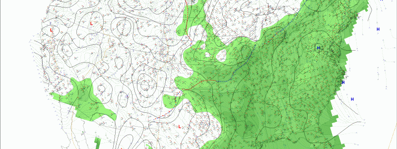
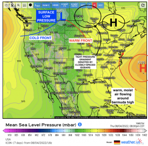
As we get closer to the surface and within the planetary boundary layer (bottom of the atmosphere where friction plays a large role), chaotic processes have to be considered as we see pressure gradients via temperature differences, solar heating and cloud cover, fronts that may yield convergence of air, and changes in sea-level pressure that can have implications in the very near term regarding forecasting. Surface analysis requires an in-depth look at what exactly is going on. For instance, I annotated the mean-sea level pressure pointing out some features that directly catch the eye. How these features move and what’s surrounding it influences downstream at a later time; therefore, it’s important to analyze the surface by keying in on specific features.
Now that’s just the entire broad gist of it. There’s a lot more to this of course, like analyzing soundings (profiles of the atmosphere through its vertical structure via radiosondes), satellite imagery, radar, and even just walking outside and getting a “feel” of the atmosphere because you almost want to immerse yourself in it. Forecasting is kind of like an art: it’s something we try to construct like putting together a jigsaw puzzle and what pieces go where. It’s not easy. I mean try imagining a rotating sphere with fluid gases that are in constant flux, then try to pinpoint a specific area of what’ll happen in a few days. It’s remarkable a feat meteorologists have accomplished thus far, and as numerical weather prediction improves and more research is completed, the more understanding there will be of the chaotic nature of the atmosphere.
For now, that’s the approach that meteorologists such as myself approaches the “equation”. Hopefully this has provided qualitative insight in what we look at, how we go about forecasting on a daily basis!



great information especially for hobby like me who is interesting in the climate. thank you so much for your time